I had a one on one discussion with Julia about what I had done so far, and received helpful criticism.
1. Even though I have plan and side view drawings, sectional drawings were missing.
2. It would be good to someone combine the exhibition space and the meeting area, therefore when the architect or whoever is talking to clients they can also discuss what is exhibited without needing to walk out, and around.
3. Change who is on what level of the firm.
Monday, 12 September 2011
Sunday, 11 September 2011

Saturday, 10 September 2011
Sketches
The design I have of my architectural firm will most likely change after I see the tutors on Monday, but this is what I have so far. So as our topic is 'gathering'- I tried to combine ideas about the gathering of people in my firm (architect, architectural historian, draughtsman, landscaper and photographer), my past projects (waking and sustenance) and the piece of architecture from the matrix (Middleton Inn).
From the begining I chose to stick with my 1:100 site model site, so immediately just began to sketch out ideas of how my firm might be placed, whether it was hung, across 2 buildings, on top of a building etc. I remembered what Ghazel had told me about trying to find similar ideas my previous projects and found it was "protection" and "security". Also my 1:100 was kind of the same - showing external noise.
So I placed it beside my 1:100 building in the corner- and came up with a design that in a way blends with the surrounding buildings but also doesnt..
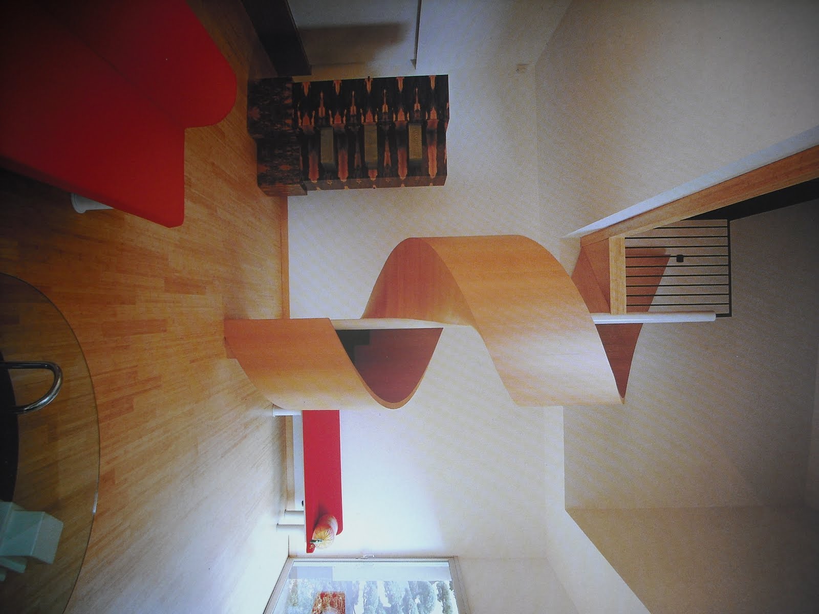
My building has rounded corners that contrast with sharp angles and curvaceous lines intersect straight ones. The undulating exterior surface is made from cement and wood, and both materials are moulded to create sinuous curves. My three main materials are concrete, wood and glass. - By using concrete I hope to link it visually with my 1:100 builiding.
When I went back to my site I really wanted to utilize the existing walkway. Therefore I designed my firm, so that the public can walk through part of the firm to get up the walkway but at the same time get an opportunity to see the work of the firms photographer- photographs of current project and research photos.
As one of my firm members has a thing for doors, I thought deeper into how I could integrate it with my idea of "security"- therefore the entrance is hidden. To the public it looks like another exterior feature. A threshold an be seen as a "the starting point of an experience, event, or venture" - so it starts in this long area which has a feeling of 'a gathering of people. - there is a big table for group discussions with clients, a table to sit, talk and eat.
From the begining I chose to stick with my 1:100 site model site, so immediately just began to sketch out ideas of how my firm might be placed, whether it was hung, across 2 buildings, on top of a building etc. I remembered what Ghazel had told me about trying to find similar ideas my previous projects and found it was "protection" and "security". Also my 1:100 was kind of the same - showing external noise.
So I placed it beside my 1:100 building in the corner- and came up with a design that in a way blends with the surrounding buildings but also doesnt..
My building has rounded corners that contrast with sharp angles and curvaceous lines intersect straight ones. The undulating exterior surface is made from cement and wood, and both materials are moulded to create sinuous curves. My three main materials are concrete, wood and glass. - By using concrete I hope to link it visually with my 1:100 builiding.
When I went back to my site I really wanted to utilize the existing walkway. Therefore I designed my firm, so that the public can walk through part of the firm to get up the walkway but at the same time get an opportunity to see the work of the firms photographer- photographs of current project and research photos.
As one of my firm members has a thing for doors, I thought deeper into how I could integrate it with my idea of "security"- therefore the entrance is hidden. To the public it looks like another exterior feature. A threshold an be seen as a "the starting point of an experience, event, or venture" - so it starts in this long area which has a feeling of 'a gathering of people. - there is a big table for group discussions with clients, a table to sit, talk and eat.
Wednesday, 7 September 2011
Research

Door design, Katharina Feuer & Jons Messedat, daab, London, 2007
Although the form is not the same as my 'waking' design, it seems to have the same idea- modular areas that are half covered and half transparent. For people walking past outside it encourages curiousity.

The door design is unique in that it includes a window bay

The walls and the doors have a really 'rustic' feel to it, which I think is because of the contrast between the steel and the vines. (Which makes me think back to my first project and original materials I had chosen)

'Paletten Pavillion' - has used the materials in a very unconventional way.

Looked into doors that dont just swing out the 'normal' way. I was thinking of incorporating a door that swings up. Thus linking with the 'portable' idea of my sustenance project. However the doors above and below are another method, and have influenced my design.

Tuesday, 6 September 2011
Sketch
I was out when I thought of an idea, so I quickly jotted it down on a piece of paper. - i have transferred it onto my A1 sheet.


Monday, 5 September 2011
Research
Examples of some different styles of staircases.


"The library of the 80's" Swedish National Council for Cultural Affairs, 1980-1989.
I also looked into famous libraries. I took the 'round setting' idea and manipulated it- which you can see on my A1 sheet.

"Doors Excellence in International design" Gretl Hoffmann 1978 Whitney Library of design, US (above & below)
The moment I saw this photo, it reminded me of my 'sustenance' project. I think its because of the modular, repetitive nature of the doors?
5
The door protudes out- They are two seperate pieces and there are hinges on either side. 


This building has the feeling of being suspended in the air, but its not. The smaller cubes underneath the massive ones gives the illusion of it floating. I have played around with his arrangement on my A1 paper.
Saturday, 3 September 2011
Thursday Crit
Yining Tan
http://ytan594.blogspot.com/

Yining's idea was that 'moment' when you take your car to the mechanics, and your just waiting around for it to get fixed, taking that wasted moment and doing something meaningful. So her secondlife building is placed on top of the vtnz building, a boring, plain, flat roofed building, so when customers at vtnz have finished, they have the opportunity to take the ramp and go up to her art gallery/exhibition space. I thought this idea was a very effective one, as its something everyone can relate to in some way. It was nice to see her building was made with plastic, as it made her 1:1 quite intriguing. It would have been even better to see some clear drawings showing the relationship between the vtnz building and her building, maybe of the ramp that goes up?
Xiang Li (David)
http://archdes101.blogspot.com/


Similar to Zoe's animation design, David's design idea is about the 'parasite'. He has created an area that is hanging high up on the exterior of another building. His idea of 'gifting', is to offer workers in the building, a "resting place", away from the busy workplace. To access this building, one goes up an elevator from inside the building. I cannot remember if he mentioned the public can access his resting place from outside as well. David had thought about the issue of his building being turned away from the natural sunlight, so explained his idea of "redirecting sunlight", and has posted info about this on his blog. David put a lot of emphasis on the exterior of his building, however none on the interior - to show how the form of the building might influence the interior spaces.
Vanessa Liu
http://vanessal-design2.blogspot.com/


Vanessa's firm is very intriguing. It is placed on top of a walkway that connects people from Symonds Street to Beach Road and visa versa. Her jigsaw pieces were made from 2 different materials, but the same colour. Through the use of wood and perspex, Vanessa was able to achieve a subtle yet nice texture. She took the idea of manipulating light - beginning from darkness and creating light by offsetting jigsaw pieces. It is an office space which is very different to its surroundings. I liked how she didn't try to use glass as a way to create light within the building.
Subscribe to:
Posts (Atom)